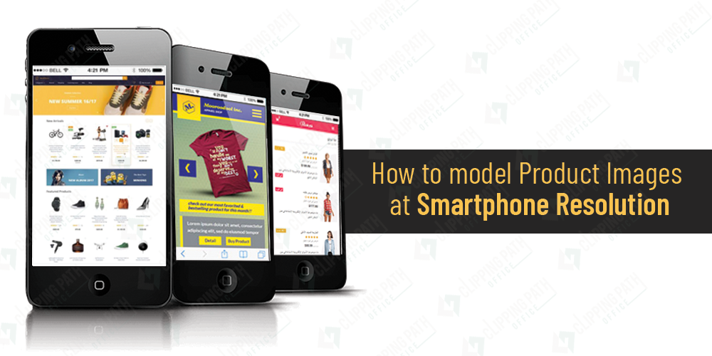
Smartphone is a considerable delivery of the technology. With every ongoing year, this technology has revised its facets vividly. At the same time, fashion of online shopping seems to be reaching new heights altogether. Mobile phones give you a vertical to shop from anywhere. If you have this technological creation in your hand, you are just a few seconds away from buying whatever you want for yourself.

Well, my topic today is not about Mobile phones. It’s about the exasperating display of product images as per mobile resolution that irritates you to a great extent and you finally decide to shut off the site. But, for your rescue, there is a technology called Responsive website that have been changing the face of online shopping.
Responsive Website is the one that provides you the optimum shopping experience. Without any scrolling, panning and resizing, you can view navigation and products conveniently on the website.
While shopping, websites that are un-optimized get maximum bounce rate. Responsive websites comprehend the device need and creates arrangement of the website accordingly. There are two major causes that sustain the idea of responsive web designs and they are truly subjective:
- More Traffic Coming from Mobile Phones: According to basic stats, Mobile devices are easy to operate and it has been comprehended that online shopping sites are getting maximum traffic from mobile devices. People have become smarter and therefore, mobile phones are becoming a vertical for them to stay smart.
- Responsive designs are given extra creditability from Google: Google appreciate the sites that ensure maximum buyer’s satisfaction and ease and rank such sites higher in its searches. Online websites that are responsive are easy to operate and give optimum shopping experience to the customers.
ALERT: Product Image on Responsive Websites
Every one of you must have shopped from your mobile devices at some time in life. Imagine that experience when you had to zoom each and every thing and then drag the screen from left to right to get the right view of the product. I can understand how irritating it feels. Then, responsive web designs surfaces and it solved all the problems.
The resolution of the screen varies according to the mobile device. All the images, text, code, etc remains the same.
All you want for your website is to look good on each type of device. Visitors expect highest quality images, regardless of the device they may be using. You need to look for every possible solution to get the task done and present applaud-able images.
I am going to describe you two methods for this:
- Using Adaptive Image Technique: Well, Adaptive Image technique is when you add a small PHP script along-with the product images at your site. This script helps in determining the device and automatically resizes the image as per the requirement of device screen size. In this case, you don’t have to fret about the quality of the image as this technique ensures optimum image quality. It is free of cost and quite liked by the website makers.
- Picturefill: Another approach is to create multiple images according to the size of screen. Cropping the image sometimes may lose it freshness and realness. But at the same time, it is important because it is the requirement of the screen. Latest HTML web standards allow you to identify the size of image in regard to the screen size. Picturefill comes into use when any web browser is not supporting these latest web standards. It is also free of cost and with its help; staging of product images on all devices could be done lot more easily.
Hi, This is Geetika Bhasin. I am a professional content writer with years of experience in researching, improvising and supplying content to my far-fetched clientele. I am fond of writing articles and stories and when I am not doing so, I will be reading or driving.


